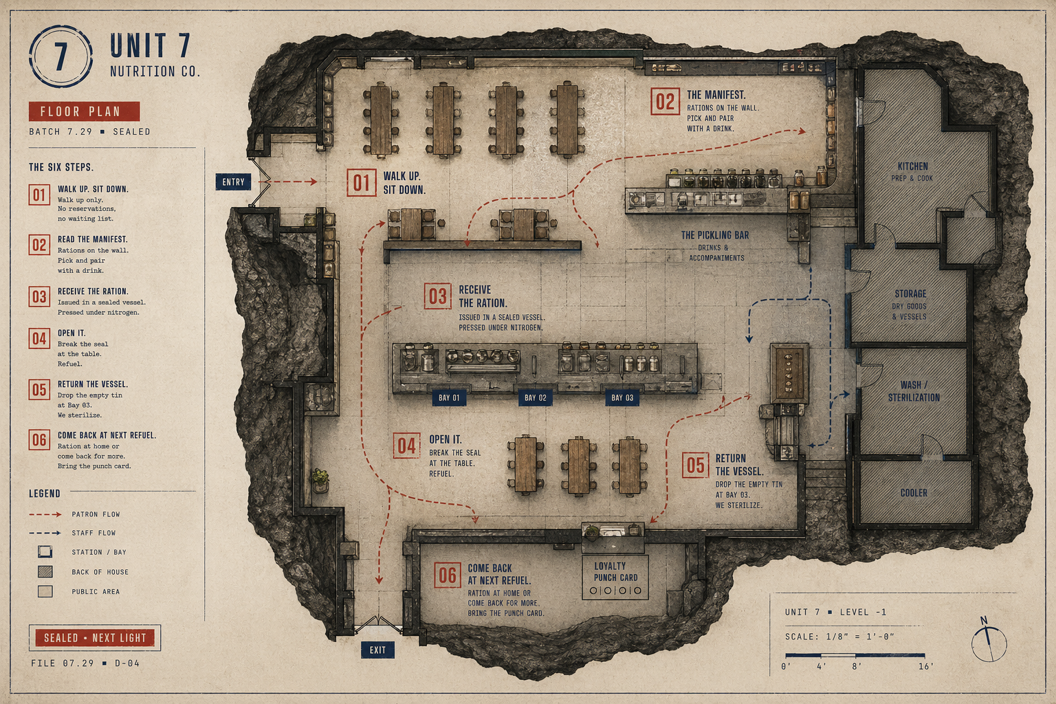
Floor Plan.
A service diagram for conceptualization. This piece shows how the brand moves from graphic identity into spatial behavior.
Format11 × 17 in
StockBlueprint
eat like it matters
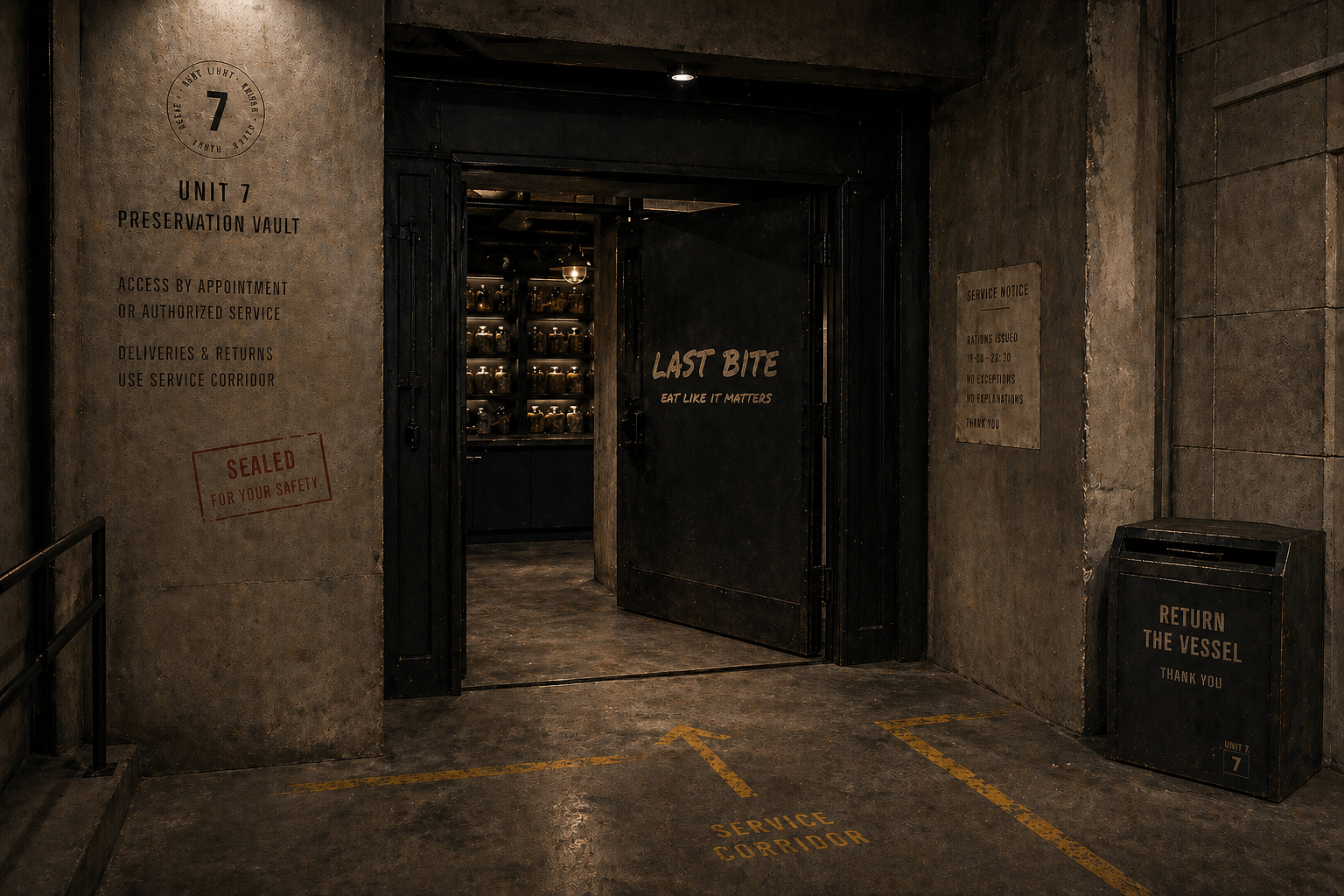
Last Bite is an immersive restaurant identity system where food is fuel, flavor is resistance, and every container comes back. Set inside Unit 7, a preservation vault beneath what used to be Los Angeles, the concept serves organic, protein-rich survival cuisine in sealed reusable tins.
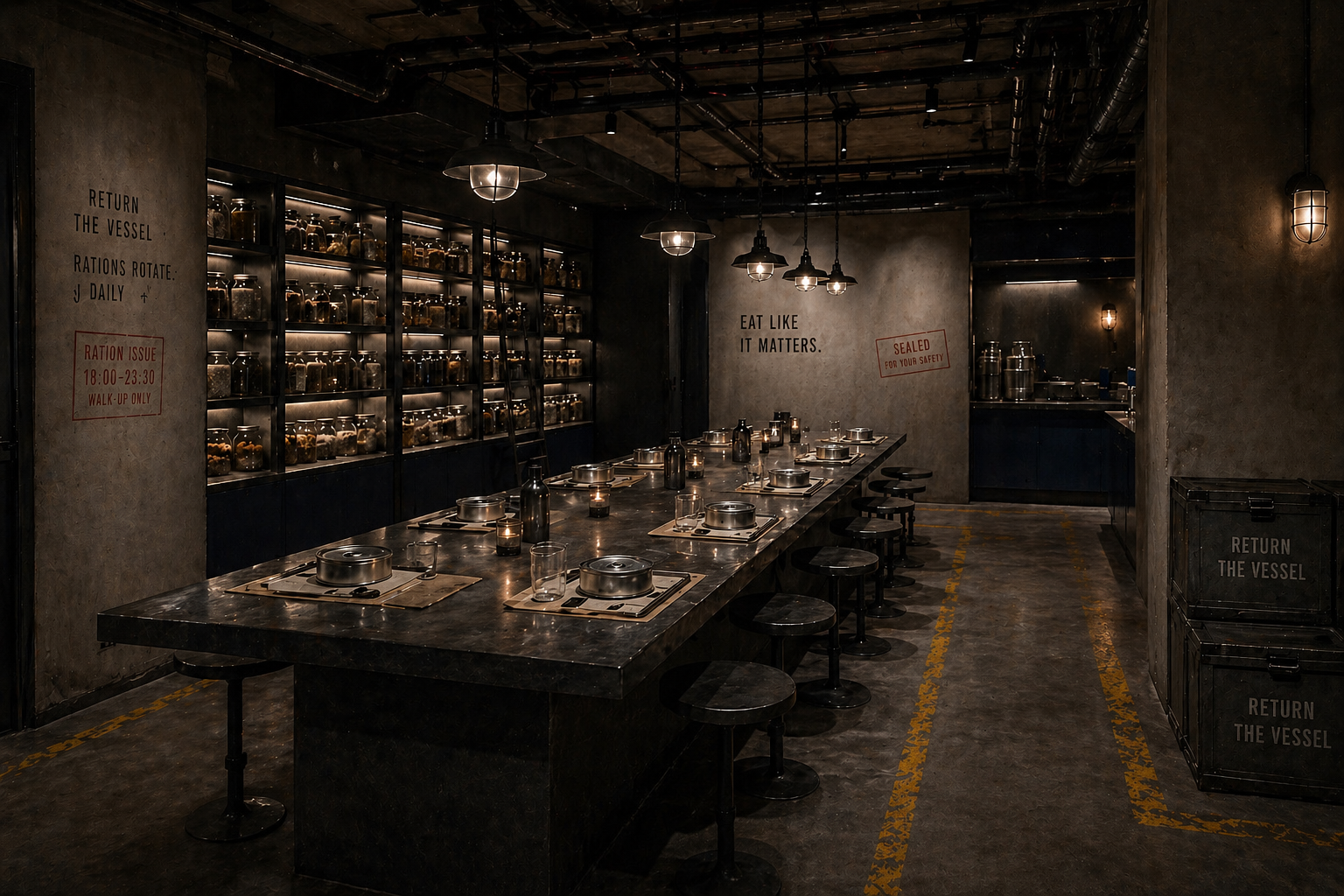
Last Bite turns sustainability into a service ritual. Climate-resilient produce, low-energy protein curing, reusable tins, and zero-waste service are translated into an immersive dining system that feels more like survival infrastructure than a wellness brand.
A service diagram for conceptualization. This piece shows how the brand moves from graphic identity into spatial behavior.
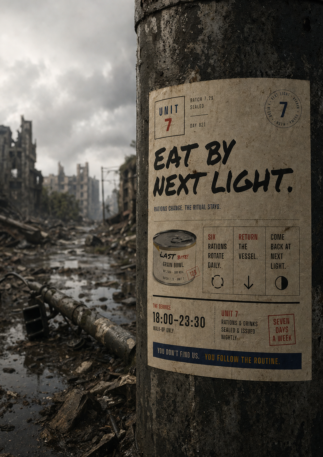
Pasted on poles, walls, and barricades above ground. No QR codes or addresses. The poster uses scarcity and mystery as the campaign strategy, making the restaurant feel discovered rather than advertised.
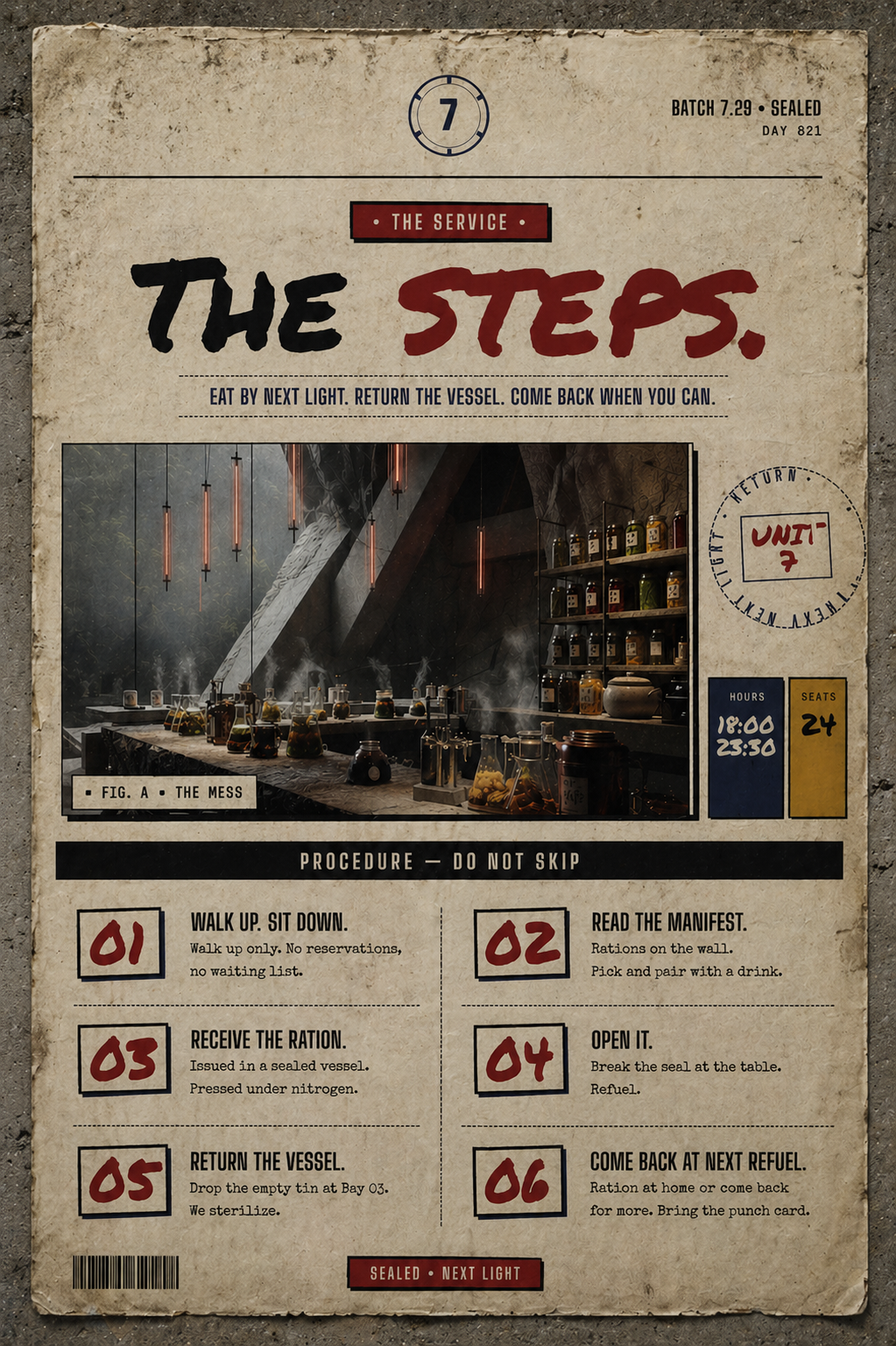
The instructions taped to the front wall of the restaurant. Six numbered steps from walk-up to next-light return. The system keeps the experience theatrical without sacrificing wayfinding.
The slashed red bar references emergency labeling, medical packaging, and fictional survival supplies.
A restrained palette built from utility, warning, and printed matter. Vault navy anchors the system across headers, panels, and service surfaces. Bone paper keeps the layout tactile and readable without feeling vintage or decorative. Stamp red marks urgency, pricing, seals, and hand-applied gestures. Utility mustard is used for wayfinding, loyalty, and operational cues. Black ink carries the typography, rules, and printed instructions.
Website and app allow customers to keep track of their credits, their returnables, drop locations, and new releases.
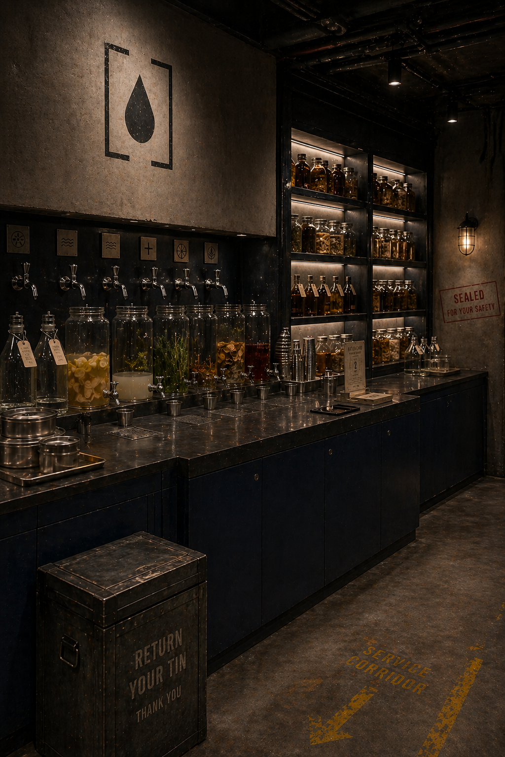
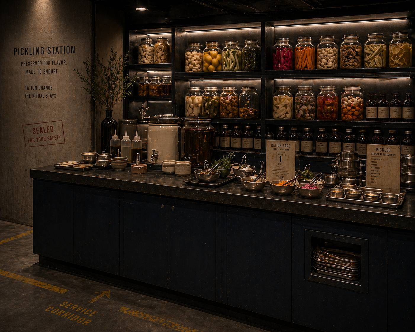
Last Bite is a preservation vault carved into rock. Climate-resilient produce, low-energy curing, returnable industrial vessels — wrapped in a service ritual that makes people lean in.
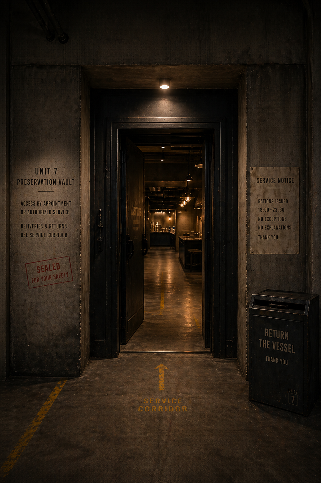
A straight-on entrance image introduces Unit 7 before the dining experience begins. The heavy industrial doorway, charcoal concrete walls, dark navy framing, warm interior light, and restrained utility markings make the restaurant feel hidden but intentionally designed.
The website starts with access rather than food. From there, users move into the manifest, reservation flow, and service rules.
The manifest page turns menu items into ration cards. Each card borrows from the packaging system: vault-navy headers, stamped ration codes, dashed rules, typewritten descriptions, and red price tags. The grid feels printed and operational, like a service record pulled from the vault.
Ration codes connect each menu item to its vessel, batch number, and service record. Vessel size, calories, and price are shown like inventory data, making the menu feel functional without losing the restaurant experience.
The website divides the restaurant into four clear areas: Ration Hall, Pickling Bar, Hydration, and Reserve. Each section acts like a posted notice inside the vault, helping users understand how the restaurant works before they arrive.
The mobile app works like a personal vault terminal, not a delivery app. Patrons use it to view today’s rations, track returned vessels, check patron credit, and manage loyalty marks. The app extends the physical return system into a digital behavior loop. The interface translates the printed system into mobile: typewritten text, stamped codes, mustard labels, navy panels, red marks, and paper grain.
Last Bite demonstrates how a restaurant brand can move beyond logo, menu, and packaging into a complete service environment. The project uses world-building to make sustainability more memorable, turning reusable containers, food categories, loyalty, signage, and digital tracking into one connected experience.