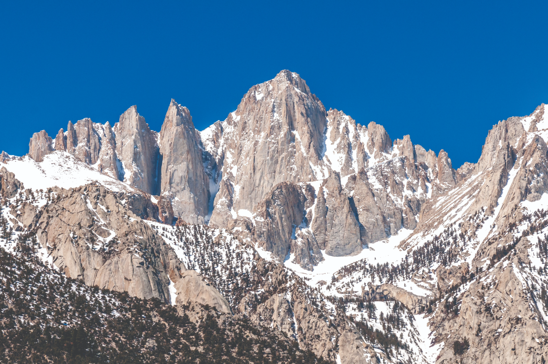
The mountain becomes the interface.
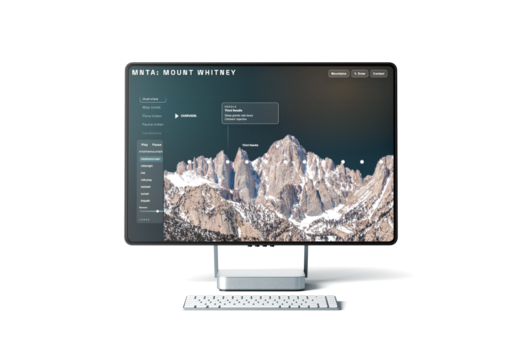
The digital platform lets users choose a mountain and move through it slowly. Instead of optimizing for speed, goals, or performance, the interface supports observation: vantage points, weather, flora, fauna, sound, and stillness.
Users can explore a mountain from different positions, hover across the landscape to identify natural details, listen to ambient field recordings, or send a selected mountain to someone else as a digital or printed postcard.
- Mountain library organized by range, mood, and time of day
- Interactive viewer with vantage points, sound, weather, and ecology
- Hover states reveal flora, fauna, stone, and environmental details
- “Send a Mountain” feature turns the experience into a shareable message
- UI stays minimal so the landscape remains the focus
at first light.
Ecology Layer.
MNTA uses ecology callouts to make each mountain feel specific. Instead of describing the landscape in broad scenic language, the interface identifies plants, animals, weather patterns, and terrain details that help users understand what makes each environment different.
- Flora and fauna callouts tied to each mountain
- Short descriptions written for non-hikers and visual learners
- Weather, terrain, and habitat details layered into the viewer
- Designed to make the mountain feel observable, not just decorative
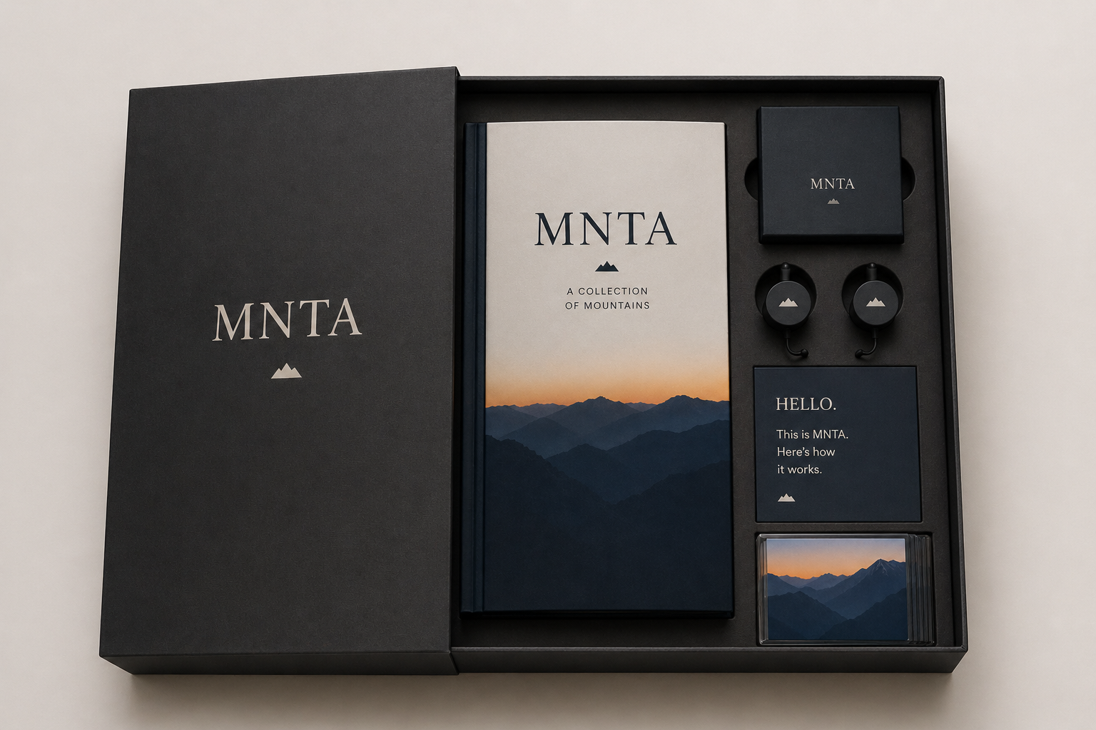
Choose a mountain. Send it to someone.
A live feature inside MNTA. Pick a peak, write a quiet line, and a postcard is delivered.